Chris Pollett >
Students >
Gargi
( Print View)
[Bio]
[Blog]
[Paper 1: Large-scale IRLBot crawl PDF]
[Paper 2: Distributed Crawler Architecture PDF]
[Paper 3: Scalability Challenges PDF]
[Paper 4: High Performance Priority Queues PDF]
[Deliverable 1: Yioop Ranking Mechanisms PDF]
[Deliverable 2(ii): Modifying Yioop's UI Editor]
[Deliverable 3: Modifying Yioop's queuing process]
[Deliverable 4: Yandex Signal PDF]
[C298: Yandex-inspired Search Factors]
[C298: Latest Page Version in SERP]
Deliverable#2: Modifying Yioop's Wiki Editor UI
A/B Testing Documentation
Abstract
I asked five users to compare the existing wiki editor UI with a few modified versions based on appearance and understandability. This demographic included varying ages and technical fields to collect a well-rounded set of opinions. To do so, I asked them to perform a set of basic tasks on each and share their feedback (possible improvements, which had better learnability, etc) to finalize the design.
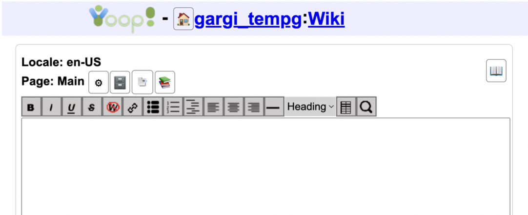
Current UI
Editor

File Upload Area

User Demographic
- UI/UX Engineer (30 yo)
- Frontend Engineer, current MSCS student (25 yo)
- Current BSCS sophomore (20 yo)
- QA Engineer (24 yo)
- Undergraduate Professor, Web Technology (39 yo)
Tasks
- Display: Chocolate Chocolate Chocolate
- Add hyperlink to the SJSU homepage (https://www.sjsu.edu/)
- Create a simple grocery list (ordered/unordered/definition)
- Create a complex list (combination)
- Change text alignment
- Add horizontal line between two lines
- Insert h2 and h4 headings
-
Insert a table with header, two columns, and three rows
(Example)
nation bender air aang fire zuko earth toph - Add and use search placeholder for "tropical beach"
- Upload (any local pdf/txt file) to main page
Editor
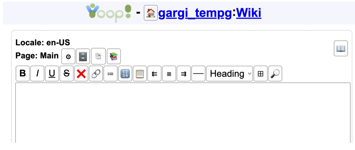
Prototype#1

Changes
- Editor buttons (rendered with background images) changed to icons (rendered in tags wrapped in tags)
-
Modified icons (appearance):
- Non-formatted text
- Ordered list
- Definition list
- Left/Right alignment
- Table
- Overall Appearance: 100% users liked this design more than the previous
-
Icon understandability:
- Non-formatted text: 60% users had to try using it with the "show" button to understand
- Ordered list: Unanimous approval
- Definition list: 20% users had to try using it with the "show" button to understand
- Left/Right alignment: Unanimous approval
- Table: Unanimous approval
- Add more spacing between the top margin (page:main bar) and the wiki editor bar
- Remove individual boxes around tools (lesser distraction)
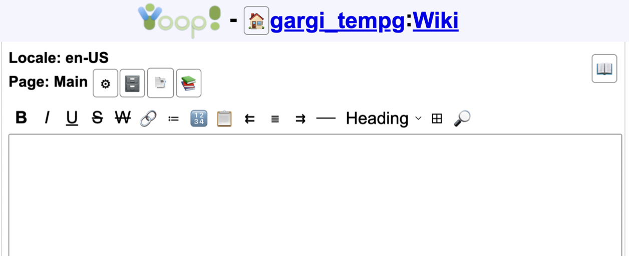
Prototype#2

Changes
- Changed icon for non-formatted text
- Removed boxes around individual buttons
- Increased margin between the top margin (page:main bar) and the wiki editor bar
- Overall Appearance: 80% users liked this design more than the previous
-
Icon understandability:
- Non-formatted text: Unanimous approval
File Upload Area
Prototype#1

Changes
- Removed box and background color from the upload file area
- Overall Appearance: 80% users liked this design more than the previous
- Retain background color around upload file area
- Add more spacing between wiki editor textbox and upload area
Prototype#2

Changes
- Changed background color to lightgrey
- Increased upload-box margin to 4px vertically
- Overall Appearance: 80% users liked this design more than the previous